Monday, September 16, 2013

A Critical Look at: Hawkeye #1

First things first. This is an experiment. There has been much said in the comic world lately about reviews and the general failing of most of them to address art or storytelling or even be more than a quick summary of the book. I'm not going to get into that whole debate. Instead, the discussion fired up an old desire I've had: Reviewing comics from a critical eye. So here's the first attempt.

And it is going to be a long read.

Second. I feel the need to at least point out who I am and where I'm coming from with this before I go into the details of this. No, I'm not doing this because I think other reviewers are bad horrible people. In fact, I don't think this is a review. This isn't being done to tell you to buy or not buy something. The goal isn't even to tell you whether a book is good or bad. Rather, I want to talk about storytelling and the comic medium. So who am I to do this? For one, I make comics. I've only been at it for a few years, but I write, pencil, letter, and study the medium intensely. There are smarter people than me and better people than me, but that combined with a degree in fine art and art history and I feel like I at least have the language to talk about the things I want to talk about. So yes: I'm nobody.
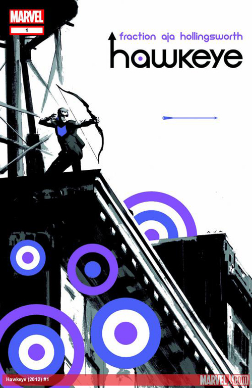

The first comic I'm going to talk about here is Hawkeye #1, from Matt Fraction, David Aja, Matt Hollingsworth, and Chris Eliopoulos. It isn't new, but it IS something I feel like I can talk about. As this goes on, some old and new comics will come in, but this is where we'll start. If you want to read along and don't have the book, it's available on Comixology if you click this link. No, I don't get anything if you do that. But it might help to follow along.

One last important thing before I get this going: I am going to do my best to talk about the book as a whole. Writing, art, color work, and lettering as one thing. That means I will do my best to not call out who did what or where, just what is right on the page and what it does. Why? Because a comic is collaborative. Without seeing the script and every communication between the various creative people, who did what is impossible to determine. So I'm not going to do that. This is also not about the story within the comic, but HOW the story is told and where and how that works or doesn't. I am also NOT referencing anything the creators of the book have talked about. This is me and just me here.

Now. I'm going to talk one page at a time, move through the story like that, and post a few images to go with it. This will likely read best if you have the book, or a digital version, in front of you, but hopefully it will read well anyway. I also apologize in advance for the quality of the images. There is some review of 'what happens' here, but hopefully only to help talk about the storytelling rather than a summary.

These are scans of the physical book, not digital versions, so I've done my best to clean up the scans a bit so they're more representative of what it looks like on the page, though you'll likely want to click on them to get a better look.

So here we go. Page 1. Panel 1.
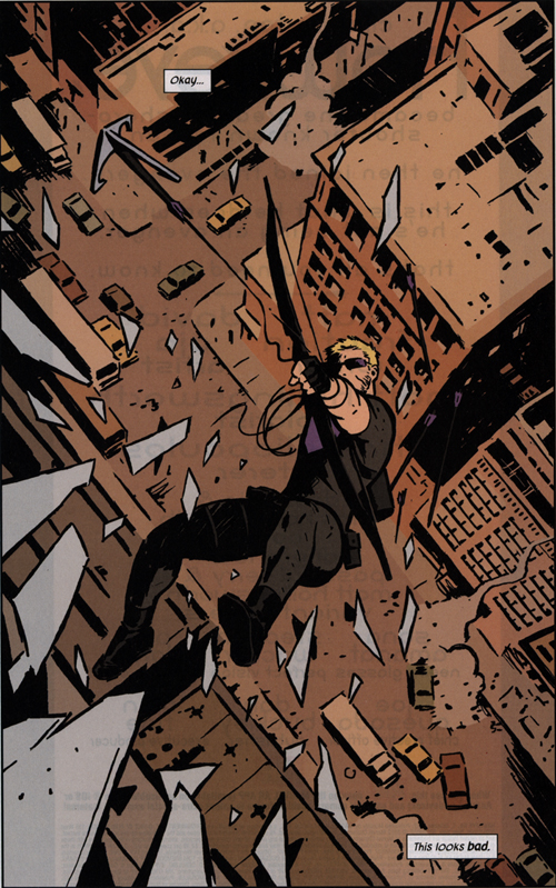
Page 1

Splash page. Big, dramatic, and immediately eye catching. Hawkeye's falling backwards. There are no motion lines, but a great sense of motion created by the grapple arrow in the foreground. It's flying up and to the left, against the flow of reading, while Hawkeye falls down and to the right, the direction you read the page. It's a great way to show tension and motion because if you look in the center, you can see how the line extends in BOTH directions...but also, we're only shown the ground below, so the threat of falling is far more prominent. A nice thing that's easy to miss are the arrows behind Clint, falling ahead of him. The way they're all falling randomly is a nice touch to add to the chaos of the page.

Line quality is something worth mentioning right off the bat, as well. Foreground elements like the glass are thicker and the lines in the ground are thin, which is standard for showing depth, but the eye catching thing here is the lines themselves. Everything is quick and gestural. The lines aren't even. They all have energy of their own. This gives every object a bit of energy and nothing really feels static, even the buildings.

The use of color is also immediately important to bring up. Hawkeye is in his uniform: Black and a bit of purple and his blonde hair. You've got the faintly blue tinted shards of glass and then the rest of the page is a huge amount of orange. It pulls Clint (I'm just going to use his name from now on rather than Hawkeye) forward. Again, this is pretty basic stuff, but it is also extremely effective. The other thing worth mentioning about the color is that it's flat. Flat isn't bad. It gives the book a very graphic quality, strongly complimenting the gestural lines, and also prevents a common problem of many comics: over-rendered coloring that distracts the reader. Here, you see what you need to see: the colors take your eyes directly to Clint in the center.

The next page is something that probably isn't expected, but I want to at least give it a nod: The credits page. There's some very nice and simply graphic design work here, and also a short few lines about what this book IS: This is about Clint when he's not being an Avenger. And on the immediate next page, we see Clint's fall go very bad, with some narration about his background in some fun narration. He tells the reader what he isn't all the while having a very bad fall, which is a very nice use of images and words working together.

Page 3 (not counting ads or the credits page here...) we get a single page that tells us pretty much everything about Clint as a character. This page is all character. Clint's narration is fairly obvious, but the strong yellows and oranges that dominate the page add to it and are a huge visual cue to the reader for things to come.

Page 4 is the other half of the visual cue. Everything is blue now. Clint's bleeding and the dog that we haven't yet seen looks to be in bad shape. Color is key to this issue. Yellows and oranges and we're in the past. Blues are 'now'. There are a couple of pages that are different, but overall that's the flow of things. And outside of the visually more beat-up Clint and the color shift, there is NOT indication of this time change. It's left to the reader to work out where things fit in.

Page 5 is back in the yellow and continuing the scene from Page 3, but it also has another visual element that ties the jumbled storytelling (timeline wise) together. Clint in Page 5 Panel 1 is in the same pose as Page 4 Panel 4, except now we've got a smile and no blood. The transition is also helped by the dialogue, both of which are quick mirrors of one another and keep the scenes connected.

Page 6

Page 6 is still yellow. And here's a page where the color does a wonderful thing by isolating Clint. He's purple and blue and, especially in Panel 4, that pulls your eye directly to him. There's a lot going on in this page, but the color keeps you looking where you should. The framing helps as well. Again in Panel 4, there's a small area around Clint where the cars give him some visual space, as well as the word balloons surrounding him without crowding. All the elements in the panel take your eye to him. Panel 5 is good to bring up for what it does differently: Clint is walking right to left. Generally, characters should move left to right because that's how we read the books, but here it's different. Why? The transition from Panel 4 to 5 to 6 is key here. On Panel 4, you're at the far right of the page, and 5 he walks back to the left side, then in 6 he's coming out of an alley in the left corner, with arrows in the graffiti pointing to Panel 7 where his body is creation a shape that leads you to the next page.

Page 6 and 7 also are the first time we get a wonderful bit of dialogue. "(Some Spanish-Sounding Stuff!)" and "Back off, (Russian maybe?)..." This is dialogue adding to character. We've had Clint's internal monologue for a few pages now, so we're already getting a feel for his voice, and now we're truly in his head when he can't understand what's being said. It's a fun touch.

Page 8 is blue again, and Panel 1 is another repeat, this time from Page 7 Panel 8. Now the blacks are heavier and the mood of the page is darker. We even end on a silhouette. A good talky page with varied angles and actual movement in the body language.

Page 9 is red. We haven't had red before. Also note another scene change with Panel 1 mirroring the final panel of the previous scene. It's evening here and an introduction to some supporting cast. Quite a lot of character moments are packed into this one page. Panels 2, 3, and 4 create a unique looking visual effect. The bottom of Panel 2 is flanked by 3 and 4, which begin and end the action. But in the center is the target. It's nice and different and something unique to comics. Last panel has a caption that is new and another use of a color cue: Instead of white, the caption is blue. Which means...

Page 10 is blue again. We meet the dog here. Clint isn't beat up. Here's page one of the blue scenes. We've caught up so the yellow is gone from this point on. And it would be wrong of me to write all of this and not at least mention the name Pizza Dog once. More fun "bro"-filled dialogue here, as well.

Page 13

Page 11, 12, and 13 are green. It's still a direct continuation of Page 10, and you can even see the blue through the door behind Clint in Page 11. Page 11 and 12 are good, moody pages of dialogue with not-too-subtle threats that some very heavy blacks only add to. And then we get the fight in Page 13. Four panels give us the card throw that starts the fight, and this time instead of the target in the center (he's last), we get Clint's full throwing motion. So you see both at once here, the step by step action, the full arc, and then the impact. And it all happens on the page at once.

Page 14 is blue and we're in the pet clinic from Page 3 again, but now we're after that point. Again, we've got transition from the previous page to the current with a similar pose: Clint being hit by the bottle, and Clint sleeping with the injury in the same pose. When the tracksuit-wearing bros enter here, we see them completely differently that before: heavy silhouettes, heads turned down, and a threatening low angle in Panel 5. We're after the fight on Page 13, but we still don't have the connective tissue between the scenes.

Page 15, 16, and 17 are that. The fight from Page 13 continues outside into blue again, and here's where something interesting happens. Panels begin to shift up and down with the lettering above or below rather than within. Instead of words within actions, here they happen separately. Page 15 Panel 2, the thought hits and then the visual along with the second thought. Page 15 Panel 4 is the opposite: Clint looks back and THEN thinks, and in the next panel continues that thought and THEN runs. This continues somewhat erratically into Page 16, but immediately stops when Clint turns around to help Pizza Dog. Now it's all in the moment again. Page 17 keeps that going, the coin trick comes back, this time traveling left to right (Usually actions like that are good to go against the flow, as it feels more sudden, but this also follows the direction Clint's hand is aiming in Panel 5. Last thing on Page 17 is that we have a scene transition happen within the page in the last three panels. Looking down, can't watch, light on the silhouette dog, and then the next panel is lit up and we're back in the clinic again.

From here on, the rest of the story is linear. Page 18 has more great-looking sound effects, and a ton of motion from the punch in Panel 3 thanks to the extreme foreground flying glasses. In Panel 4, everything is aimed at the center point: Body language, cracks in the window, folds in the clothes, and even the tails subtly take your eye to where Clint's left arm is. Panel 5 should be pointed out for the use of silhouettes and the way the villain pops because of the white stripes. No more detail, but the body language tells us everything we need to know.

Page 19 ends the scene with more exposition and strong body language. The gestural lines really pulls the page together here, as it shows us heavy rain without actually drawing a lot of rain. It's all in the negative space, especially in the final panel.

And then Page 20. Pizza Dog is fine. A nice joke, some more very strong, subtle acting through body language, and that's it. If you pay attention to the last 'panel', which doubles as a sort of title page, you also get the dog's name as the story title, a payoff to the page's joke that isn't entirely confirmed until a few issues later. Big thing here, though? One and done. This is a complete story. Clearly, more can come, but everything that was set up had a payoff.

So there we go. I'm not sure how much of this format will be the same next time I do this, or even what book the next one will be, but I can assure you more are coming. I'm open to comments on how I'm handling this, but I'll say right now I doubt I can get much less wordy. I'm a wordy person and I feel like, to do justice to this kind of thing, this kind of length is going to be important. So I hope you liked it and I hope it helps and I hope it isn't completely incomprehensible.

Monday, September 9, 2013

Thoughts on Marriage in Superhero Comics

That's right, I'm back to rambling here. Going to try to make this more regular (again). A few things are in the works that will hopefully be regular and good.

For now, though, I want to talk about one of the current hot-button topics for superhero comics: marriage.

It's been brought to the forefront of discussion a few times, but this time it's come up because of the DC comic Batwoman. I'm not going to recount everything, so here's what's important for the purposes of this post: The creative team on Batwoman announced they were leaving the book due to creative differences with editorial. One of their specific reasons cited was DC stating that Batwoman and her fiance, Maggie Sawyer, would not be allowed to be married...ever. This turned into a "DC won't allow gay marriage!" as headlines everywhere and the truth turned out to be "DC does not want their characters to be married." This extended to the point of stating that, essentially, NONE of the major characters in the DC Universe are married since their reboot a few years ago.

This isn't the first case of marriages in superhero comics having trouble and being dealt with in somewhat strange ways. A prime example is Marvel's breaking up of Peter Parker and Mary Jane via a deal with the devil a few years ago. Not to mention the various other cases of marriages ending in strange and/or horrible ways throughout the years.

Okay. So. Why?

A common stated reason from companies in breaking up marriages is that characters being married ages them more than they'd like. Peter Parker being married to Mary Jane Watson took Spider-Man from being the younger loser to, in some eyes at least, a middle-aged guy living a more normal life. Marriage also tends to lead to the idea of children, and heroes having kids is another thing entirely. There's at least some truth to that perception, especially when you want to get more kids reading comics and are having trouble pulling that off for various reasons that would require at least ten more blog posts all on its own.

Another reason given is that marriage limits storytelling. Marriage is seen as stability, when it comes to most superhero stories. There is a sense of marriage tying down a character and limiting what future creative teams can do. Now, this isn't a completely wrong thought. Generally, a main character that's married won't be able to juggle multiple dates and saving a city while trying to keep a normal job, and that kind of thing is a staple of superhero comics.

A very accurate statement about superhero comics is that they are constantly second act stories. Essentially, this just means that your origin and basis for the character are well and done with and the nature of these corporate characters is that they won't actually have direct endings, so you never get a true resolution for them. Instead, smaller story arcs will get endings of varying levels, but always with a forward momentum to the next adventure.

I'll keep using Spider-Man as an example here. Peter Parker is a character driven by guilt. Uncle Ben is killed by a burglar that Peter let go, reasoning it wasn't his job to catch criminals. Afterwards, guilt drives him to actual superheroing and there's the Spider-Man we all know. Probably worth adding in guilt over the death of his girlfriend Gwen Stacy, as well, but the key point is that Peter Parker's key trait as a character is struggling with his failures. So there's your second act. But the moment he gets over this guilt, by finding a way to deal with or just through the passing of time, the story ends. That's it. Your act three for this story is Peter coming to terms with all of this, and the nature of superhero comics demands that this NEVER HAPPENS.

What does this have to do with marriage?

Well, for a vast majority of stories, the character getting married and settling down is the end. Act three is the hero getting the girl, to put it in overly simplistic terms. It's the idea of ending your story with "happily ever after" with marriage essentially representing that. The hero settles down, fade-out, and all is well and done. So, for many that look at superheroes, getting married is the END of the story. Structurally, it does make quite a bit of sense.

So here's the part where I really get to ramble: My thoughts on all of this.

On a purely structural level, I don't disagree with this and I actually completely understand the vast number of comic writers that feel they can tell better stories with unmarried characters. Everyone has different ways of doing things and it's not actually right or wrong.

However! The larger sweeping justifications that are generally brought out are, on the whole, kind of bad.

Here's the thing. I was 24 when I got married. That's still pretty young. Now, I know people in their 40s that have been single all their lives. My perception is skewed. To me, marriage isn't really tied to age. But I CAN understand the corporations not wanting characters that are meant to appeal to younger audiences being perceived as aging up too far. At least on this point, I'm more or less willing to concede or call it a draw.

The larger issue, I feel like, is the idea of marriage as the end. All of the struggles of life don't just stop when a person gets married. If anything, a strong argument can be made that they're all heightened. This isn't to say that it doesn't get terribly cliche when stories go to the well of "The hero's significant other has been kidnapped!" but...well, that's still the same if the characters are dating. In fact, many of the perceived problems with marriage still exist with characters that aren't married! Married characters still have the worry of marriages ending, family in danger, or anything else that a single character does if they've got a significant other of some kind, which most superheroes do.

On the one hand, when it comes to corporate characters, blanket declarations like "Our characters will not be married" are going to happen. They own the characters, they can do what they like with them. But I feel like the problem comes in with the very idea that married characters cannot be interesting in stories. Good writers can make anything work, and while some would argue against it, there ARE a ton of great writers working in superhero comics today doing fantastic work.

So this thing is going to keep happening. There are legitimate reasons for blanket decisions like this. But, for the record, married characters aren't boring. Marriage doesn't age a character too far. If that were true, there wouldn't be a huge number of Spider-Man fans that are my age, who only ever knew a Peter Parker that was married to Mary Jane Watson.

Monday, April 22, 2013

Some Thoughts on Seren

So begins my effort to actually use this blog. If all goes well, expect more updates here that are generally less formal and likely more rambly than previously. We shall see how it goes!

I don't do a lot of talking about any of the thought process that does the ground work for the webcomic my wife and I work on, Of Stars and Swords. Mostly, I like to let the work speak for itself. That's the idea, at least. But after talking with people at Megacon this year and seeing some things other creators have been saying about their own work, I've been rethinking my silence.

So here is the result, some thoughts about the comic's main character, Seren. There will be some mild spoilers here, mostly from the first twenty pages of the comic that detail some important background, but that should be about it. If you don't want those spoilers, go read the pages then come back here!

The best place to start is at the beginning, so here's how things came together. The basic idea of what would become Of Stars and Swords always had it's inception in a fairly common concept: There are two brothers from a noble family, one is a jerk and one isn't. The latter gives up money and power and all that goes with it for a happy life with a loving family, but the former isn't about to have that and murders the family because he's a jerk. The family was always a wife, a son, and a daughter in my mind. In the initial thinking, it was the son that survives and goes off to find his father and get revenge.

At some point, obviously, that changed. Why? I'm not too terribly sure. The best I can remember is lying in bed, staring at the ceiling and thinking about all of this when I wondered why not have it be the daughter that survives. Somehow, that thought made everything else click. Why not have it be the daughter that survives and wants revenge? Her being arrogant, stubborn, a teenager, and all the other things that make her insufferable and/or wonderful were pretty quick to follow. She became a very well realized character in a short amount of time, to the point that I knew exactly where she had to begin and where she'd end up once all was said and done.

Writing Seren comes easy for me. I have never been a teenage girl with a murdered family in a fantasy setting, but I was a teenager and I look back on that with one clear thought: I was a little shit. We all were, really. In my mind, we all went through pretty much the same crap at that age, and it's just a matter of tapping that to find where Seren's voice is. She's stubborn, she thinks everyone around her is an idiot, she doesn't listen to advice, she doesn't think about anything but the goal directly in front of her, and she's very easily put off when things don't go her way IMMEDIATELY. And the worst part? She's smart, capable, and able to back up a lot of her talk with actual skill and ability. Plus, she's pretty good with a sword and fairly quick to use it.

In a lot of ways, she's a pretty terrible person. In those first twenty pages, we see her kill a man because...well, just because. There's no real good reason. She just does it. And barely thinks twice about it. It's a moment that made sense to me writing it, but has been jarring for at least a few readers. And it should be, honestly. I'm actually surprised that people ever admit to liking her at all, as we've seen very little of Seren being anything but a borderline bad person. Even writing her, sometimes I just want to yell at Seren to take some deep breaths and go pet a turtle or something for just an hour, because if she keeps brooding and yelling at everyone her face is going to get stuck that way and then I'm just going to type in run on sentences out of rage at how infuriating she can be.

But sometimes she does make the right decision. Sometimes she takes those revenge blinders off and there's a moment of possibility that she COULD be better. She just...keeps going the other direction. Obviously, the reason to keep reading is to see if she ever does turn things around, so I won't say anything on that. She might, but she might not. There are some rough moments coming up in the story, and so far Seren hasn't proven to deal with those all too well.

Before I end this stream-of-conscious-like blog post, I want to babble about one more thing. Namely, Seren being a girl, and a fully clothed one at that. Comics, especially, have a big problem with how female characters are depicted, and things are definitely in the process of getting better...but fantasy is a genre that seems to have even more problems with that, especially the fully clothed part. But here's the thing: Seren isn't a girl OR fully clothed to buck any trends or show people 'how it's done'. Seren is a girl because...well, I mentioned it before. She just is. It fit. The story came together the second that thought hit. Why? I don't know. And why is she fully clothed? Well, because she is dammit. Her design is something I put together that Caroline has then tweaked since she's the one doing the penciling, but even that was never a 'I'll show them!' in how she's dressed. It just made sense. Fantasy worlds are full of sharp and stabby things and, besides, showing skin is cold and stupid and just asking for trouble. You're all just lucky she doesn't have a mask or hood, as well, because that would sure make all the sneaking around a lot easier.

And I've rambled enough. I don't know if any of this makes sense, but it at least can give you an idea of where Seren came from and where I come from in writing her. Or I just read like a crazy person, which isn't terribly inaccurate. Either way, if you guys find this kind of thing interesting, I'll gladly do more of this in the future. Probably do it anyway, maybe even more about Seren as Of Stars and Swords moves along.

Saturday, December 31, 2011

Five Comic Picks of 2011

Okay. So, honesty first. I've not updated this blog enough. I've still got quite a lot to say, but the need to work has taken over most of my writing. If you don't also follow my art blog I share with my wife, I just put up a a good post explaining how much we're working on. 

In addition, as mentioned over there a ton but, it looks like, not really at all here, we launched our webcomic back in October! If you haven't seen it, please check it out. We're both working our butts off on it: Of Stars and Swords.

So that out of the way, here's a slightly different kind of post for this blog that fits in with the fact that it's the last day of the year. I don't like lists, and I don't like putting things in a ranked order, but I can at least mention some comics that were, for me, the best of the year. I'll keep it five, since any more than that and I'll just ramble on until another year has passed.

And in no particular order, here are my comic picks of the past year.

NOTE: Click the images to get a better look! (I feel terrible constantly saying that, but...)


Daredevil: Mark Waid, Marcos Martin, and Paolo Rivera have put a new life to a hero I always enjoyed but tended to mostly ignore overall. This book is on quite a few 'top comics of 2011' lists and for damn good reason. Mark Waid is telling a story that is fun, enjoyable, and not at all the painfully depressing stories that poor Daredevil has been stuck in the last two decades. Now, those dark stories aren't bad. Some of the best things ever are right in those by amazing writers, but the current Daredevil book is just a fun read. Heavy things happen, but it doesn't weigh the reader down.


And the art. Marcos Martin and Paolo Rivera have just killed on the art. It is one of the most beautiful books out there right now. I'm just going to pick one image for each artist to show off, but each issue is full of pages you can stare at for days. In a good way. How these two artists are finding ways to depict Daredevil's sonar vision constantly amazes me, as well as the strong uses of sound effects to highlight his hearing.

It's just all around good.

Journey into Mystery: Thor's evil half-brother Loki died a year or so back in the comics. He's been back as a kid lately, not so evil and trying to be good while still being the God of Tricks you'd expect. That basically sums up the main character, a kid trying not to be his former self. But there's so much more to this book and I have a hard time explaining why it's so good. It is another fun book, and that is always a plus to me. Loki as a kid is hilarious. He deals with technology in great ways (his early anger at being called an internet troll on forums and wondering how they could know that he's half-troll still makes me laugh).

But beyond just the fun of the character, the stories are good. This book actually has subplots, subtle character shifts and tons of moving parts that come together exactly when you wouldn't expect it in the perfect way. Nothing is left hanging, story wise. If something is left behind, you can bet there's still a story there and it'll be handled by Kieron Gillen very well when the time is right. Not to mention the one off-stories  being some of the best in comics: A literal "Devil walks into a bar..." story, an amazing Christmas story, and a great telling of the major Marvel even of the year, Fear Itself, through the eyes of the always-entertaining Volstagg.


And, again, the art is something else. This book has had a fairly large group of artists coming on and off the book in the past year, but there's been a consistent style held very well between all of them. Even when the artists change, the book feels very much the same. I'm partial to Mitch Breitweiser's art, so he's the example I'll show. That also has the plus of his wife, Elizabeth, doing the colors and she is one of the best out there right now.

The Flash: I'll admit it, I'm a Marvel guy. I always have been. That doesn't mean I don't have some DC characters I've always vaguely enjoyed without being too deep into the actual reading. Flash has always been a character I've loved the idea of, and DC's New 52 was the perfect jumping on point since everything is new again!

This book is only four issues in right now and it is absolute stunning. Francis Manapul and Brian Buccellato are telling a very good superhero story and using Flash's powers in very interesting, unique ways. Not only that, but putting the Fastest Man Alive in a situation where an entire city is experiencing a simultaneous disaster is just perfect and exciting to read.


But I'll admit to there being one real reason why this book is amazing. It's all about the art here. Manapul's art has always been great, but this book is something else entirely. Page layouts are absolutely insane at times, telling things about settings just by how the panels themselves are structured. Each issue has a title page that is put together in ways I've never dreamed comics could do. And the best part? They all read absolutely perfectly. Crazy, unique layouts and perfect readability is a the holy grail in comic art for me.

FF: Much earlier this year, Johnny Storm of the Fantastic Four died. But this didn't become a dead weight on the Fantastic Four as one might expect. Instead, Johnathan Hickman turned things around. The book was relaunched as FF (standing for Future Foundation) with Spider-Man taking the fourth spot on the team and then the entire cast of characters building up over Hickman's run joining together in one huge super-science super-hero team.

This book, along with Hickman's lead up to it with Fantastic Four, brought me back to the First Family of Marvel. Hickman is able to write the super-science well and tell some insane stories with it all. There are wheels within wheels within wheels here. The plots can get complicated, but never overwhelming. It just creates a way to always want to turn the page and then the hard wait for the next issue at the end.


Of the five comics I'm talking about, this is the only one where the art is not a big reason for my enjoyment. Now, that is hard to type without sounding like I hate the art. And I don't. FF has had some great artists, with Steve Epting being a guy I've always loved as an artist. His work is a highlight, and all the other artists that have been on the book have done stellar work...but with FF, for me at least, this is about the story. I'm in this for Hickman's wild story.

The Red Wing: Which leads perfectly into another Hickman work. I feel bad that this is my only indie book listed here, but it's been a damn good year for more mainstream comics in my view. The Red Wing is something else, too. It's a story about time traveling fighter pilots.

Just let that sink in.

There is nothing in that sentence that doesn't appeal to me.

The best part? That barely scratches the surface. The Red Wing is a four issue series, so it's short and straight to the point. But there is an insane amount of content in just these four issues. The plot is a mostly basic idea, but Hickman takes the time travel concepts to insanely logical lengths. This book gives headaches when you read it, and the good kind. What happens when and why are always there to be asked, and even at the end of it all...I'm not 100% sure how it all came together. But somehow, I like that. I can read it again, and I have, and see things connect in different ways and put pieces together.

The Red Wing makes you think. Hard.


And it is gorgeous. Artist Nick Pitarra goes crazy with designs of everything and there is not an ounce of laziness here. Backgrounds are as detailed as anything, and he visually shows the acts of time travel in amazing, wonderful ways. Can you tell I loved this book?


So yeah...there you go. My five favorite comics of 2011. If you haven't read them, I highly recommend them all. And if you have read them...well...weren't they awesome?!

p.s. to add one more book to this list without going into detail: Amazing Spider-Man. Read it. Just read it.

Tuesday, October 25, 2011

More Thoughts on Female Comic Characters

This might be a bit more directionless than some of my posts, so you've been warned.

As the days have continued to pass, my mind has been continually on the topics surrounding the problems with the comic industry, how to solve them, etc. As I'm not a business expert and, at the moment, just an aspiring creator with only a small amount of independent work to show, this is all still coming from a fairly outside view. Perhaps that's a good thing, though, as most of the problems that tend to exist with comics are due to the insular nature of the current medium.

Lately, the hot button topic in regards to superhero comics has been the treatment of women. This is not a new problem, but it is one that dies down every so often. It hasn't ever actually been solved, and that baffles me. Everyone knows the stereotype. In comics, men are huge muscle-bound guys and women have huge chests and tiny waists. To a point, one can attempt to argue that both are exaggerations, and yes, they are, but they are different kinds of exaggerations. Both are an idealization, but both come from (and are for) a generally male point of view. Thus, the aspects of men in comics that are emphasized are that of physical power and strength, where as female characters tend to be idealized sexually. Posing in comics is a bit of a staple, that pause where the hero shows their power, but it is, again,  quite different with male and female characters. For some reason, female heroes tend to stand in such a way so as to show off as much of their bodies as possible, many times in positions that normal human spines would snap in.

This is not just a problem with comics, either. Most all media directed towards male audiences is this way. Look at action movies, especially those that star female characters, for basically the same problem. The only real difference is that movies require actual people, so the ridiculousness of proportions doesn't happen to the same degree. But here's the thing. The physical aspects of the problem are the obvious ones and the thing that most people tend to latch onto. But in my view, they aren't truly the problem.

The problem is the next layer down, and that's characterization. Even if the art in comics changes overall to show more varied body types for female characters, none of that will do any good if the overall characterization of women in comics remains the same. While we're nearly entirely beyond the stories of the 60s and the 70s where all the women, even the Fantastic Four's Invisible Woman (Invisible Girl at the time...), are simply damsels in distress, many stories still contain obvious male/female splits when it comes to the roles they take. It is true that there are a great many more female heroes today, but they still tend to take a back seat to the men.

All of these are problems or issues that you most likely know of on some level already, whether you see it as a problem or not is up to you, but most people do realize that it's there. Yet this is all considered normal to us. Men are our action heroes culturally and have been for a thousand years. But for most of that history, when it comes to women in the stories, they exist as objects or a reason for a plot. Active roles for women in stories are a very modern thing, and the transition to female action heroes even more. Yet, somehow, female action heroes are sexualized in ways that males are not. The obvious reason is that the action genre in any medium (TV, Comics, Movies, Books) is aimed at men, and it's no secret that sex sells.

But to me, this feels wrong. Usually, these are subjects tackled by women, something I am very much not. I don't claim to have some special insight, but the thing is, I don't think it's necessary. To me, this kind of thing has never been a so-called "Women's Issue" and I've always felt that framing it as such misses the point. The longer we bury ourselves in this thinking, the longer we'll have to deal with bad stories and the more we put off new, great things.

It is possible to tell a good action story with a female lead that doesn't rely on her being half-naked or constantly posing for the viewer. In fact, it has been done more than once. That isn't the issue. I'm not saying this doesn't exist, just that it should be the norm. Young girls deserve to have role models in Batgirl, Wonder Woman, Wasp, and even Mary Jane Watson without their only actions being centered around sexualization. And that doesn't mean some characters can't be more focused on sex. Some people are. Men and women.

But, again, it shouldn't be the norm.

Not only that, but those women that do read comics shouldn't be ridiculed when they point out these problems. No one should. If this medium is going to continue, it's going to need men and women reading. The explosion of manga a few years back proved that girls will, indeed, read comics if you give them subjects they want to read. And thankfully, while the big two companies may be slow to change, the indie market will continue to lead the charge into places where we should have been all along. Hopefully, as indie creators push forward, Marvel and DC won't wait too long to catch up.

Wednesday, September 28, 2011

The Future of Comics

I've spent the last few posts talking all about the history of American Comics and I hope all twelve of you reading enjoyed that, because now we're going to move from the world of facts to a place that I've slowly been moving things towards since the last update all about art in the 90s.

Time for some wild speculation that will all be proven wrong in just a few years!

Now, the comics industry is in a very odd place right now, a great deal of which is due to the world of digital comics. Webcomics exploded years ago and the market is so over saturated that, while there is a great deal of good out there, it's hard to sift through it all to find that. And really, there is a ton of gold out there to be found, but I'll talk more about that another time. Right now, though, digital comics on the iPad and other similar devices is what the industry is grappling with.

In many ways, it's a fight similar to the battle that books are having with e-readers, just on a smaller scale. The two major players in the industry, Marvel and DC, both have their own apps within which one can download comics at a price that is usually comparable to the same price of print comics, but until very recently, one could only get older comics, nothing brand new, digitally. Though this has changed, the problem of pricing remains and highlights the major problem that both Marvel and DC run into with digital: the fear to be the first to dive in head first.

Some would say that, with DC's recent relaunch of their entire line of comics, they've taken this dive already. And yes, DC has made some good steps, with Marvel doing much the same. Both now make all, in the case of DC, and nearly all, Marvel, of their comics available digitally every Wednesday, the day new comics are released in old fashioned, brick and mortar stores. But the prices, as mentioned, are horrid. $2-$4 for a digital copy of a roughly twenty page comic? That just won't work. Not for long, at least.

Digital is going to grow, one way or another, and it's vital for their survival that both Marvel and DC figure out how to do things reasonably. Partial stories delivered monthly like serials of old, the current model of the industry, is a dangerous gamble when combined with the instant gratification that digital creates. Is the cost worth the time to read and then the time to wait for the next issue? At the moment, no, so two obvious things definitely need to happen, though when and if they actually do is questionable.

First, page counts for digital comics need to go up. Someway, somehow, the publishers have got to find a way to release larger books digitally. The idea of digital trades, collections of finished stories that put all the single issues together, is already out there and being done, and the pricing is a bit better, but it still isn't enough. If one is expected to pay $4 for a digital comic, at least double the size of the book. 40 pages for that price begins to feel more reasonable, and even more so at $2. Yes, it's low, but that's how digital works. The music world has gone through this with iTunes and you'd be hard pressed to find many people that are willing to pay more than $0.99 for a single song. A comic needs to be as near that price point as possible.

But this is more an issue for the Now than the Future, so I'll stop going in circles and try to look ahead here.

So yes, I have no doubts that digital is the future, at least in some form. And I also believe that, like books, the physical comics will never truly disappear, though they may become a smaller and smaller piece of the market on the whole. There will always be a group that want the physical things, the music world is, again, a good example of this.

Stories will likely find a middle ground between the current trend of heavily serialized, overarching story lines and the classic so-called "one and done" story, which is more self contained, obviously. In some ways, this is a fight of style that will never truly go away, but the last few decades stories seem to have shifted dramatically from one side to the other, with the industry more strongly on the side of heavy serialization right now. But these things tend to balance out over time, and both types have merit. I'm fairly sure the industry needs to do both, instead of one or the other, if only to bring in more readers who prefer different types of storytelling. You'd be amazed, or perhaps not at all, but how many fans have left comics in the last decade because they feel they can no longer pick up any single issue and enjoy it on its own.

Beyond this, I do think webcomics will mature on the whole. I'd like to believe that we can move away from all webcomics needing to be joke-a-day style comics and push into more serious topics and genres. The content delivery of the internet shouldn't restrict the genre and the main reason for the current over saturation is that 90% of webcomics really are just the same joke style comics as everything else...and not funny. There have always been a small number of more serious, traditional-styled comics and stories in the webcomic world, and I'm glad to see more and more appearing in the last couple of years. If these kinds of webcomics are allowed to grow, it will only do good and, at the very least, allow more people the chance to tell stories and possibly even get noticed by the industry at large.

There is one major danger in looking forward, though, and that is nostalgia. In many ways, American comics are built on nostalgia, and to a point that's okay. But if the industry gets caught up in only catering to the group that wants to relive their childhood through comics, things will not continue for long. New is vital. And new can be done with old things. Some of the best stories with classic characters have been told in recent years, and I have no doubt that even better stories lie ahead, but none of that can happen if the industry allows itself to grow smaller and smaller without reaching out beyond its current audience.

In many ways, that's why I made this blog and write all of these long winded ramblings about why I love comics and feel they're a legitimate art form. There is something here for everyone, but that still requires the publishers to put it out there FOR everyone.

Okay, well, it looks like I had less to speculate about than I'd thought. Still, there are a couple of similar topics to this I want to talk about all on their own. So as the days go by, I'll have another artist-specific post finally go up, tackle webcomics in a much more focused way, and probably finally get around to talking about this DC relaunch and what it means...since this Wednesday marks the last of their new books and it'll be a perfect time to look at how this can be a good or bad thing for the industry, both artistically and overall viability.

Oh, and one last thing. My last post I horribly disparaged the long-running, never ending Spider-Man story, The Clone Saga. I want to remedy that cruelness. Yes, it continued to almost end and then go on, and when it finally did end, no one was happy and it was a convoluted mess, but I will say one very good things came out of it that probably shows, more than anything, my age. Spider-Man's clone, Ben Reilly, is a great character and one that deserves a return. So there, the Clone Saga wasn't all bad. Just...mostly bad.

Monday, September 26, 2011

A Look at Comics History: Art in the Modern Age

Okay. Here we are. This subject is the first of two that started my desire to run through comics history as I' done in the last week. Before I dive into the meat of this, though, I feel it's important to preface what I say. As I've mentioned before, I want to stay positive on this blog. This all comes about through a love of art and comics, especially when they come together. Sometimes, though, we have to look at failings and identify just what went wrong so as to know how to avoid those problems in the future, for the good of the medium. This is going to get into some fairly negative things and strong criticism on the artistic end of things, and I feel that is necessary and important.

But, and this is a big one, any and all critiques are about the art, NOT the artists. I hate that I feel the need to state that, but it's vital and my years of art school taught me that all of us, myself included, can have trouble separating art from artist when it comes to criticism. Good people make bad art and bad people make good art. That's life, and I'm not here to judge people, only to talk about art.

This leads into one other important bit that many people, artists and non-artists alike, have trouble accepting: While art is subjective, all art contains objective elements that make them up. There are objective qualities with which we can judge all works of art, simple things like use of line, shape, and perspective, etc. Now, this does not discount someone from LIKING a piece of art or a style that fails on those levels. Everyone has a different taste, and that's perfectly fine. I'm not out to judge taste, and I want to make sure that is as understood as the last point.

On that note, I want to put in a bit of honesty to back up the point. Jack Kirby is the king of comic book art. American comics owe everything to him, both stylistically and in the way stories are told. Everything about how he handled the technical aspects of art are damn near perfect and he knew exactly how to lead the eye across the page without error...not to mention the man had one of the greatest imaginations ever. But, for years and years, I looked at early comic art, especially Kirby's, and could not understand why it was good. It looks blocky, formless, and just primitive to my younger, untrained eye. After a few years of college, both making art and studying the masters of history, and I came back to see Kirby's art was shockingly greater than I had ever dreamed. Before this, I couldn't understand how composition truly worked, why he deconstructed forms in the way he did, or why I should care about the art when compared to modern art that was, on the surface, prettier and flashier, but not nearly as effective 90% of the time. I've heard this same story from many other young guys that are interested in comics, and I think it goes to show how much deeper art can be beyond simply whether you like something or not. There are fundamental reasons why some art works better than others, and understanding those can really open a person's eyes.

So. Comic art. Before I can dive into modern art, I have to, yet again, hit a couple things to back it all up and give it some grounding. Though I briefly ran through the different era's of comics through the past century, I didn't really focus on art styles and how they changed too much, but it's important to understand that a great deal has happened to art in comics through the years. Styles have evolved and changed to the point that, today, we have a mix of wonderful retro styles that emulate the best of the Golden Age creators, crazy stylized art that looks like almost nothing else, hyper-realistic art that most people never imagine could be in comics, and, of course, everything in between. Comic are is shockingly diverse today, and everyone is the better for it. But some things have been left behind because they were bad or just not as effective. That's how a medium evolves.

Artistically, the Modern Age of Comics started out very similar to the Bronze Age. George Perez's art on Crisis on Infinite Earths wasn't altogether different than what had come before. This isn't to say it was bad, as the style is wonderfully effective at telling stories, but Perez's art is much more what could be classified as 'traditional' comic art. One of the biggest breaks from this style to something more unique was thanks to Frank Miller in the previously mentioned Batman: The Dark Knight Returns. Miller's art is heavy, filled with blacks and thick lines that help the mood of the book wonderfully. There's really nothing pretty about his work, with everything purely dark and hardened. It's exactly what the book needed. But Miller's style is very much his own, and though some have emulated him, it hasn't ever really caught on as a style.

Which leads right into a style that did catch on. As I talked about last time, the early 90s saw the rise of literal superstar artists: Jim Lee, Tod McFarlane, Rob Liefeld, Erik Larson, and Marc Silvestri are the ones I see as the main guys to look at for defining the art, and, interestingly enough, all were founding members of Image Comics. This is, of course, just a small list and I'm likely to only talk about the first three, but the interesting thing is that all of these artists shared many similarities in style.

In some ways, it's hard to define what exactly makes the art of the 90s so different. Usually, it's easy to identify the second it's seen, but describing a trend is harder to do, so apologies if this comes out as nonsense. On the whole, though, the art sharpened. Literally sharpened. Lines tended to all come to points, and everything was given a sharp feel, on the whole, from everything to how forms were put together to lines used to shade an object and give it depth. The art of the 90s is heavily focused on line, almost to the exclusion of all other elements. It has the effect of making all of the art much more aggressive, and this fit the tone of the stories of the time fairly well.

This isn't an inherently bad thing for art, but it is distinct. I grew up on Jim Lee art, and though my tastes have shifted, his X-Men will always be my X-Men when I first think of them. While that's definitely nostalgia talking, to a point, I do think that Jim Lee is one of the best and defining artists comics has ever had. To me, this image here is the quintessential Jim Lee for me, and I expect many, many others. You can see the heavy, distinct use of line here without having to look hard. But this heavy focus on line starts to break down when it comes to the construction of form. It's a pretty heavy trait of 90s art that the men are huge and muscled while the women have tiny, tiny waists and giant chests, and most of that can be seen here, though not to an insane degree. The real problem here that really sticks out at me and is a pretty serious trouble in comics these days, still, is the way the women pose. None of that, save for maybe Storm's flying forward, looks at all comfortable or natural. There's a feel of posing for the reader, and that's a trouble comics still struggle with greatly, especially with regards to female characters.

In many ways, Todd McFarlane's art of the time is similar and there isn't too much different to be said. Instead, I really want to use his art to focus on another thing that became a big deal in the comic art of the time. The extreme use of line had a habit of just getting out of hand. Lines are just everywhere, and in some ways it feels like an indecipherable mess. There are many images where I feel bad for the colorists trying to determine what is what, as the glut of lines just leads to confusion. What's odd is that this became a way to tell if an artist was 'good'. For some reason, the idea seemed to be that, the more lines one used, the more detailed and stronger an artist was. The idea of implied line was lost and any subtlety was gone in an instant. The real beauty of much of the older comic art, especially Jack Kirby's, is subtlety and expert use of line...and where not to use line. The art of simplicity just disappeared entirely with the superstars of the 90s, and this harmed the medium greatly.

So now we get to a name I expect many reading this that know comics have been waiting for: Rob Liefeld. He is equally reviled and adored in comics today, and there are enough people out there tastelessly bashing the guy for his art. I'm not here to do that. And no, I'm not a fan of Liefeld's art, but that doesn't require me to come across as a complete asshole in the hopes of getting hits here. It is actually possible to discuss art one doesn't like in calm, intelligent terms without being a complete jerk, and that's my goal. So...

Liefeld's art essentially takes the stereotypes of how we seen 90s art, huge men and tiny women, etc, and expands on them ten fold. One can go on an on about those subjects, and others already have and, if you want to read them, you can find them pretty easily with a google search. All the points that I could really make about his art I've made in my generalizations already, just that he really took them in his art and pushed them further. So why not take a different direction and look at WHY these seemed to work, when on almost any artistic level, they're just bad?

I think it works and sold for some simple reasons that I hit on last post. In the 90s, comics became all about flash and no substance. It was all about ultra-violence, blood, guts, swords, big guns, and insane plots that really were just excuses to have cool, dramatic splash pages. Liefeld's art is all of this. The quality of the line work, the way the shapes just fail to actually look like what they should, and the problems with perspective that are there didn't actually matter to the readers of the time because Liefeld's art had what they wanted more: Violence, action, and guns. What does it matter if a figure doesn't have feet if, right there on the page, a guy's head is being chopped off? But that's the real problem. Art takes work, even comic art, and somehow, the industry was caught in a phase where the quality really stopped mattering and the content, as ridiculous as it was, really dominated. As much as some people look to the comics of the Golden Age and Silver Age as 'bad art', this is untrue and an uninformed opinion, whereas the art of the 90s really, as a whole, did active harm to the industry and the medium while really holding no value of its own.

Essentially, I think Liefeld's art tends to epitomize what went wrong with comics in the 90s, though it wasn't WHY things went wrong. That confluence of troubles I've already talked about, and the art is only a single part of that. To blame all of it on Liefeld or any artist in particular is stupid, when the companies themselves were happily releasing these books, speculators were eating them up, and so were fans...creating even more demand until it all just tanked and nearly destroyed everything. The fault is on everyone, but that doesn't mean we can't learn, and I think the medium has.

In all honesty, I think it's pretty clear that I'm not a fan of the 90s and comics. This was my first introduction to the medium and I didn't stay for long thanks to the art, and looking back I find that, unlike with other eras, I still don't find much with any merit. I could a great deal more negative than I have been, and maybe even more positive, but the former leads to coming across like a jerk and the latter would mostly be untrue. I've tried to at least be as objective as possible here, and if that makes it feel like I've just skipped over large topics to hit on here, well...I do apologize but it's likely I can't say much without devolving into angry ranting and...well, the internet has enough of that.

As I've said, if you look at comic art now, there is a diversity of styles that is unequaled in the past. It's almost as if all the years were building up to a huge artistic and sales crash in the 90s, just so we could come out of it, as a medium, wanting something more. Today, guys like Jim Lee and Rob Liefeld are still working, and that's great because they have fans that want exactly what they do. But the world of comic art is no longer dominated by just one style. Now there are men and women like Chris Samnee, Skottie Young, Amanda Conner, Marcos Martin, Sara Pichelli, Emma Rios, John Romita Jr., David Aja, Francis Manapul, and countless others out there creating art, all in a variety of styles that cover so many angles that there really is an art style for everyone.

So maybe we needed the insanity of art in the 90s. Maybe that homogenization of sharp, odd art that didn't really succeed at anything beyond being flashy and in-one's-face was the kind of wake-up call to artists and readers that diversity is good. So hey, maybe the 90s weren't all that bad.

Not that I suggest you go read Spider-Man's Clone Saga. Whew, that's still a mess.